Web Accessibility simplified
October 21, 2025

Why web accessibility matters?
Web accessibility ensures that websites are usable by everyone, including people with disabilities, such as those with visual, auditory, motor, or cognitive impairments. It's crucial for equal access, legal compliance (many countries have accessibility laws), and improving user experience. Accessible sites also reach a wider audience, boost business growth, and enhance SEO. Additionally, it demonstrates social responsibility, helping organizations build a positive brand reputation. In short, web accessibility benefits users, businesses, and society.
Making website accessible improves the experience for all group of people that may be using it on mobile devices, in restricted quiet environments, slow networks or just temporary having technical problems as broken mouse.
So how can we improve website accessibiity? Here are few most important aspects.
1. Semantic markup
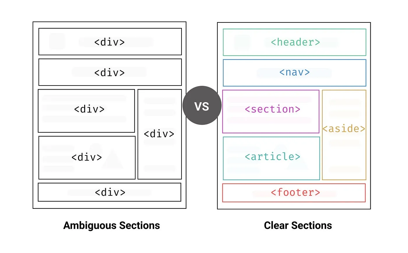
Structure of the page is one of the most important aspects of web accessibility. By using proper structural elements, you give critical context to people using assistive technologies (AT), such as screen readers. It improves readability and clarity of your code, improves SEO ranking and ensures browser compatibility. Adding landmarks regions representing the organisation and structure of a web page creates shortcuts for areas user wants to access. The most relevant main landmarks are <header>, <main>, <section>, <article>, <aside>\ and <footer>. Example of using it correctly:
Before using speciallized library, check if HTML doesn't already have a built-in solution, for exmaple use <details> element for accordions.
<details name="faq">
  <summary>How can I equest a refund?</summary>
  <p>
    You have up to 30 days to request a refund. See our T&C for details.
  </p>
</details>

<!-- etc. -->
ARIA enables developers to describe their widgets in more detail by adding special attributes to the markup. In order to differentiate landmarks of the same type is by labeling them using the aria-labelledby or aria-label attributes
<nav aria-labelledby="pagination_heading">
  <h2 id="pagination_heading">Pages</h2>
</nav><header>
<nav aria-label="header menu">
</nav>
<header>
<main>
<h1>Page title</h1>
<p>Page content</p>
</main>
<footer>
<nav aria-label="footer menu">
</nav>
</footer>
Headings
Two important rules to follow:
- Every page should have unique <h1> element to represent the page title
- Heading should follow the hierarchy and visual order
If the design doesn't include H1, it should be added just for the screen readers with sr-only class (screen readers only).
<h1 class="sr-only">Page Title</h1>2. Noticeable and meaningful text
To start with setting the lang attribute for html tag and page title to describe the document indicates what the page is about.
<html lang="en" dir="ltr">
  <head>
    <title>Page Title | Site description</title>
    ...
  </head>
  ...
</html>
Alt text for images and icons
Text alternative for non-text elelements - for images and icons using alt text, for audio and video content including subtitles.
Good alt text describes information that the image contains. It can help not only visually impaired users, but also search engine bots understand image contents, improving site’s visibility in search results and user experience when image fails to load.
 Tree in a field, source: Unsplashed
The alt tag can be left empty when the image role is simply decorative, for example the text accompying the picture gives enough information.
<img src="tree-in-the-field.jpg" role="presentation">
Elements that need clarification like icon-only buttons that for most users are easy to guess but could be problematic for people using screen readers. For these elements we choose one of 4 options:
- Use aria-label with descriptive text
- Add aria-labelledby attribute pointing to element with id and descriptive text
- Use title atribute on the button, similar to aria-label
- Setting sr-only class on element containing descriptive text
Examples of using these:
- aria-label
<button onClick={} aria-label="Settings">
  <svg class="cog-icon">...</svg>
</button>- aria-labelledby
<button onClick={} aria-labelledby="settings-div">
  <svg class="cog-icon">...</svg>
</button>
<div id="settings-div">Settings</div>- title
<button onClick={} title="Settings">
  <svg class="cog-icon">...</svg>
</button>- sr-only
<button onClick={}>
  <svg class="cog-icon">...</svg>
  <span class="sr-only">Settings</span>
</button>
Another example that needs informative text are input elements like labels, that could be optionally hidden with 'sr-only' class when design doesn't provide.
<form>
  <label for="name">Your name:</label>
  <input name="name" placeholder="Name" />

  <label for="email">Your email:</label>
  <input name="email" placeholder="Email" />

  <button type="submit">Submit</button>
</form>
3. Focus state and feedback
Focus indicators
When navigating website using only keyboard users rely on focus indicators - by default blue outlines around elements like buttons and inputs. They help screen readers to keep track of users location on the page. Focusable elements are:
- links
- buttons
- form fields(text input, select boxes, radio buttons)
- tooltips triggered by hover
- widgets
:focus-visible allows you to show focus states only when users are navigating using their keyboards — while :focus is showing the indicator also when clicking it with a mouse.
a:focus,
button:focus {
   // :focus appears on click and tab
  outline: 1px solid green;
}
a:focus-visible,
button:focus-visible {
  // :focus-visible only applied when navigating with keyboard
  outline: 2px dotted pink;
}
Action feedback
When form is submitted user needs feedback. In order to not to be so instrusive best way to notify user of a change is to set on the element that is chaning an aria-live equal to "polite" . The screen reader will speak changes whenever the user is idle not interrupting user flow.
<div aria-live="polite">Form submitted</div>Another example where it can be implemented is single item carousel, notifying politely the user that the visible content has changed.
  <section role="region" aria-label="Slideshow carousel" aria-live="polite">
      <div role="tabpanel">
        <h4>Slide 1</h4>
      </div>
       <div role="tabpanel">
        <h4>Slide 2</h4>
      </div>
    </section>
4. Colour contrast and animation motions
It's important to pay attention to how the colour is used on the screen, as you cannot use color alone to convey information, actions, or distinguish a visual element. Adding another identifier, like a pattern, text, or icon, is crucial to help people understand the content. The rule indicates that a contrast ratio of at least 4.5:1 for small text and at least 3:1 for large text (Level AA)

The media query @prefers-color-scheme allows users to choose a light or dark-themed version of the website, while @prefers-contrast checks if user's OS setting are set to use high contrast.
However avoid very high contrast like white text on black background as it could be strain on user's eyes.
Following colour contracts media queries the @prefers-reduced-motion
@media (prefers-reduced-motion: reduce) {
    * {
        animation: none !important;
        transition-duration: 0s !important;
    }
}
If needed to check in JavaScript:
const isReduced = window.matchMedia(`(prefers-reduced-motion: reduce)`) === true || window.matchMedia(`(prefers-reduced-motion: reduce)`).matches === true;

if (!!isReduced) {
    // DON'T use an amination here!
} else {
    // DO use an animation here!
}
Tools that can be used to measure accessibility
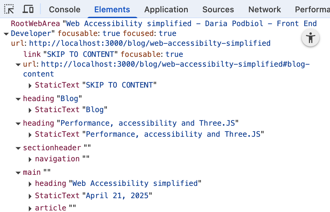
Chrome Dev Tools
The Chrome Dev Tools comes very handy in terms of checking the Accessibility Tree. To access it in Chrome press Cmd + Shift + P (on Windows Ctr + Shift + P* ) and type Accessibility. In the Accessibility tab enable full-page accessibiity tree option.
When enabled, you need to reload Dev Tool and you will see the little round icon in the Elements view, which toggles between DOM view and Accessibility Tree view.
Linters in development
When developimng you can check the accesibility rules with the help of linters, for example ESLint plugin jsx-a11y or Biome linter with a11y rules. They will check your code and give you warnings when you are missing alt text, using non-interactive element with interactive role or when you have an interactive element without focusable content. Excelent tool is Biome formatter as extension to VS Code, IntelliJ and Zed. Simply just add your rules that's need to be checked in biome.json under linter rules a11y:
// biome.json
 ...
"linter": {
  "rules": {
    ...
	"a11y": {
				"useKeyWithClickEvents": "warn",
				"noSvgWithoutTitle": "warn",
				"useAltText": "warn",
				"useValidAnchor": "warn",
				"useAnchorContent": "warn",
				"useMediaCaption": "warn",
				"noInteractiveElementToNoninteractiveRole": "warn",
				"useFocusableInteractive": "warn",
				"useValidAriaRole": "warn",
				"noRedundantRoles": "warn",
				"useIframeTitle": "warn"
			}
  }
}
Conclusion
Improving web accessibiity benefits the user, the company, search engine bots. By implementic the rules of using semantic code, described icons and images, we improves readability, SEO and performance of the website. By adding focus states and feedback we make sure that users using assistive technologies can navigate the website and understand the changes on the page. By following colour contrast rules we make sure that content is visible for everyone, including people with visual impairments. By using tools like Chrome Dev Tools and linters we can check the accessibility of our website and fix any issues that may arise. Web accessibility is an ongoing process, and it's important to regularly check and update your website to ensure that it remains accessible to all users.